Design is where most trays fail
There are a lot of rolling trays in the world. Most of them are forgettable. A logo centered on a plain background, a cannabis leaf clipart, a generic gradient. The design was clearly made by someone who thought any image would do the job. It won't.
A tray that people actually want to display, show to their friends, or use as a prop in photos requires a design decision, not just design presence. The ideas below are organized by category and style. Some are for individuals who want something personal, some are for brands or dispensaries building a product line. I've included honest notes on what works and what tends to fall flat when it goes to print.
If you want to jump straight to ordering, custom rolling trays covers the product options. But read through the design categories first. A better-informed brief saves time and usually produces a better result.
Minimalist designs
Minimalism done well is not about using less effort. It's about using negative space intentionally and trusting that a single well-placed element is enough.
A tray with a matte black background and a small white wordmark in the lower right corner can look more polished than one covered in design elements. The key is that every element needs to be intentional and high quality. A minimalist design shows off whatever is there, which means bad typography or an imprecise logo shows up clearly. If your logo was designed by someone who knows typography, this style rewards it. If your logo has issues, cover them with something more complex.
Single-line botanical illustrations work well here. A thin-line cannabis leaf, a wave pattern, a geometric shape. The line weight matters: too thin and it disappears in the printing process, too thick and it loses the delicate quality that makes minimalism work. Lines should be at least 0.5mm at final print size.
Monochrome color schemes with a single accent color are another minimalist move that looks professional. Black tray, white type, one line of gold detail. It's a three-element design that reads as considered and intentional.
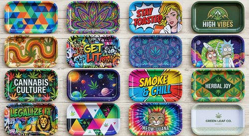
Psychedelic and pattern-heavy designs
The opposite end of the spectrum, and popular for good reason. Rolling sessions have cultural roots in music, counterculture, and visual art that lend themselves to dense, colorful, complex imagery.
Mandala patterns, fractals, and radially symmetric geometric designs fill the tray surface well because they naturally extend to the edges. A mandala that begins at the center and radiates outward uses the full canvas without requiring the designer to figure out how to fill corners.
Trippy landscape illustrations, think melting clocks or impossible geometry in the style of 1960s and 70s poster art, photograph well and generate the kind of "where did you get that" reactions that drive organic discovery. They work best in vivid colors with good contrast. Sublimation printing on metal handles this style well because color saturation is high and details come through clearly.
Repeating pattern tiles are underutilized. A single illustrated element, a frog, a mushroom, a koi fish, repeated in a grid or staggered pattern across the whole tray surface is visually satisfying and more original than most cannabis-specific clip art. It also scales well to different tray sizes without redesign.
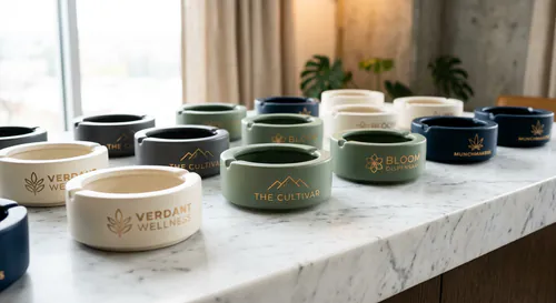
Brand-focused designs for dispensaries and cannabis companies
When the tray is a marketing product, the design has to work differently. It needs to carry brand identity clearly while still being something a customer wants to keep and use.
The mistake most dispensary marketing teams make is designing for the brand brief rather than for the customer's taste. A tray covered in the dispensary's brand colors, logo, tagline, website, and phone number is an advertisement, not a product. Customers don't display advertisements.
The better approach is to lead with a design that the customer would want regardless of branding, then apply brand elements within that design rather than around it. A branded tray with a beautiful illustrated landscape that happens to have the dispensary name integrated into the composition as part of the art, not as a title card, will get displayed. The same landscape with a logo slapped in the corner and text filling the bottom quarter will not.
Brand color palettes often work better as background and accent colors than as primary design elements. If your brand colors are forest green and cream, design a natural illustration in those colors. The colors communicate the brand without the tray feeling like a billboard.
For multi-product branded lines, think about design continuity rather than design sameness. Each product in the line should look like it belongs to the same family, but they don't need to be identical. The tray might lead with an illustrated scene while the grinder uses an engraved version of the same motif. That's a coherent brand, not a copy-paste operation.
Pop culture and reference designs
This category needs a legal note before anything else: reproducing copyrighted characters, films, shows, or music imagery without a license is a real legal risk. I'm not going to encourage anyone to pirate an IP. What I will say is that works in the public domain, which includes enormous amounts of art, illustration, and photography from before 1929 in the US, are available to use freely.
Vintage botanical illustrations from 19th-century scientific publications are freely available, look beautiful when applied to a tray, and have a quality that modern stock art rarely matches. Audubon bird prints, old anatomical illustrations, historical map imagery. All of it is accessible and none of it has licensing risk.
Homage and inspired-by designs that reference a visual language without reproducing specific protected work are also fair territory. A tray that captures the visual energy of psychedelic concert posters without copying a specific poster isn't infringing anything. Work with a designer who understands where that line is.
For personal trays rather than commercial products, pop culture references for private use don't carry the same risk. If you want your personal tray to feature your favorite album artwork or a film still you love, that's a different calculus than a dispensary selling or distributing 500 units with an unlicensed character on them.
Nature and landscape themes
Mountains, forests, oceans, deserts. Nature themes are popular on rolling trays because they work at the aesthetic level without being cliche in the way cannabis-specific imagery often is. A forest illustration on a tray reads as outdoorsy and grounded. A cartoon weed leaf reads as a novelty item from a head shop.
The Pacific Northwest has a particular visual aesthetic that has crossed over into cannabis culture: dark green forests, misty mountains, moody weather. Pacific Crest Trail vibes. This works because the culture overlap between outdoor recreation and cannabis in that region is genuine, and the imagery resonates with that audience regardless of whether they're from there.
Desert Southwest imagery, mesas, cacti, sunset colors in burnt orange and terracotta, has the same natural fit because of the cannabis culture in states like Arizona, New Mexico, and Colorado. The colors in that palette are warm and distinct from the green-heavy cannabis default aesthetic.
For brands, nature themes age better than trend-driven designs. A tray designed around a mountain landscape will still look intentional in five years. A tray designed around a meme reference will look dated in eighteen months.
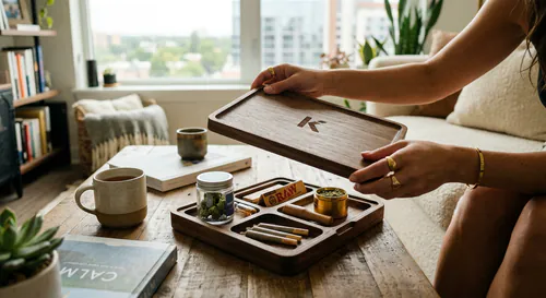
Custom photo designs for personal trays
Having your own photography or artwork printed on a tray is one of the cleanest ways to make something genuinely personal. A photo from a trip you care about, a portrait of a pet, a piece of artwork you made. These designs mean something specific to the person who ordered them, which is different from anything you can find in a catalog.
Photo quality requirements are real though. The photo needs to be sharp and well-exposed at the size it will print. A phone photo taken in good light at full resolution is usually sufficient. A screenshot from Instagram at a compressed file size is not. The rule I always tell people is: if it looks sharp when you zoom to 100 percent on your laptop screen, it will probably print well. If it looks soft or pixelated zoomed in on screen, it will look worse at print size.
Color management is also worth noting. Screens display color in RGB. Print processes use CMYK or specific color profiles. Bright, saturated colors on screen, especially electric blues and neon greens, don't always translate to print with the same intensity. If color accuracy matters, request a physical proof before committing to production.
Artist collaboration designs
This is an underused category for dispensaries and brands with a bit more budget and creative ambition. Commissioning an artist to design a tray, crediting them visibly on the product, and positioning the tray as a limited-edition art object rather than a promotional item creates something with a completely different market positioning.
The artist gets exposure. You get a product that people collect rather than just use. If the artist has a following in the cannabis or art community, the distribution and word-of-mouth value from that association can be significant.
Rates for original illustration work vary enormously depending on the artist's profile and the usage rights involved. A local artist you find on Instagram might work for $200 to $500 for a tray illustration with commercial rights. An established illustrator with a cannabis-adjacent following might charge $2,000 to $5,000. Both can be worth it depending on the size of the run and the marketing value you're trying to generate.
The key is clarity on rights upfront. You need full commercial rights to reproduce the artwork on the tray at whatever quantity you plan to produce. "Artist credit" is not the same as "commercial license." Get it in writing before production starts.
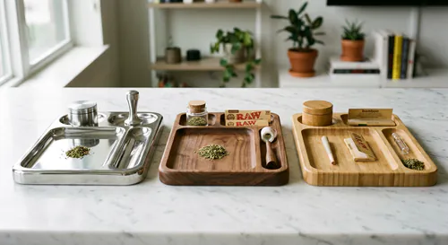
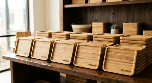
DIY and blank tray options
Not everyone needs a professionally printed tray. Blank metal trays are available at low cost and accept various DIY methods fairly well.
Acrylic paint adheres to tinplate steel with some surface prep. Clean the tray, scuff the surface lightly with fine sandpaper, and apply a spray primer before painting. Seal with a clear acrylic top coat when you're done. The result won't be as durable as a sublimation print but it'll look genuinely hand-made, which is the point.
Vinyl decals are another accessible option. Cut vinyl is available from services like Cricut or from local print shops. A well-designed vinyl decal applied cleanly to a tray looks polished and is easy to replace when you want a different design. The edges can lift over time with heavy use, but for a personal tray used at home, it lasts.
Resin pours are popular for creating one-of-a-kind trays with embedded objects, colors, and textures. The tray becomes a resin casting mold. You get something genuinely unique but also genuinely time-consuming to make. If you enjoy the making process, it's satisfying. If you just want the result, it's not the most efficient path.
For a deeper look at the blank tray DIY process including specific techniques and material recommendations, there's a detailed walkthrough at rolling tray decoration guide. And if you want to build one completely from scratch, the DIY rolling tray tutorial covers that too.
How to brief a designer if you're not doing it yourself
Most design confusion comes from briefs that describe the desired feeling without enough concrete input. "Make it look premium and on-brand" is not a useful brief. "I want a dark background, one to two colors maximum, our wordmark in the center at roughly 60 percent of the tray width, and a subtle texture in the background that doesn't compete with the logo" is a useful brief.
Reference images are faster than words. Find three to five trays, packaging designs, or other products whose visual style you like and include them in your brief. Don't explain why you like them. Just show them. A designer who can't extract useful information from reference images is not a designer you want to use for this.
Be specific about what you don't want. "Don't use cannabis leaf imagery" eliminates an entire category of defaults. "Don't use gradients" tells the designer you want flat color. "No cartoon illustration" steers away from one aesthetic toward another. Negatives are often more informative than positives.
Give the actual tray dimensions and bleed requirements to the designer before they start. Designing a square composition and then having to adapt it for a 10-by-6-inch rectangle with a 3mm bleed is annoying and often results in compromises. Starting with the right canvas avoids that.
For a full look at how the custom rolling tray ordering process works from design file to finished product, that guide covers the technical requirements in detail.
Design trends worth watching, and one to skip
Y2K-adjacent aesthetics, metallics, chrome textures, bold sans-serif type, are performing well right now in cannabis visual culture. They photograph well against both dark and light backgrounds and feel current without being too niche.
Hand-drawn botanical illustration has been building for a few years and isn't going anywhere soon. It sits at the intersection of wellness aesthetics and cannabis culture and resonates across a wide age range.
Abstract expressionist backgrounds, gestural brushstrokes, paint smears, ink textures, used under clean modern type, are a format that looks genuinely high-end without requiring a complex illustration.
The design trend I'd skip right now is heavy mid-century psychedelic pastiche. It was genuinely interesting three years ago. It's now the visual equivalent of a dispensary with "420" in the name: it signals something specific about a brand's age and originality. If you're trying to reach customers under 35, it's probably working against you.
Design a tray you'd want to keep if it weren't yours. That test, taken honestly, cuts through a lot of bad decisions before they become expensive ones.