Why most cannabis brands look the same
There's a specific aesthetic that cannabis branding defaulted to for most of the past decade: dark backgrounds, heavy use of green and gold, serif typefaces with a slightly antique quality, and photography of the plant itself or of "lifestyle" moments that could be stock photos from any of three dozen brands. If you've spent any time on dispensary websites or in retail shops across multiple states, you know exactly what this looks like.
It happened because the industry was young, compliance requirements made some design choices feel risky (anything that might look too appealing to minors, anything that implied health claims), and designers defaulted to a small set of reference points. The result is a category where visual sameness is so prevalent that customers often can't articulate meaningful differences between brands they've bought from for years.
The brands that have broken out -- Stiiizy, Kiva, Cookies, PAX, Canndescent -- share almost no visual language with each other. They don't look like "cannabis brands" in the legacy sense. They look like well-designed consumer brands that happen to be in cannabis. That's the aspiration worth aiming at in 2026.
Defining your brand archetype before you touch design
Brand identity starts with a position, not a logo. The most common mistake is hiring a designer before doing the strategic work of defining who you are for and what you stand for, which produces expensive design that has no grounding and often needs to be redone.
Three archetypes dominate cannabis brand positioning right now, and it's worth being honest about which one fits your actual business rather than the one you aspire to:
The premium or luxury archetype is built on exclusivity, connoisseurship, and elevated experiences. Price points are high, packaging is investment-level, and everything communicates that this is for people who know quality and expect it. Canndescent's "Art" positioning and some of the top-shelf craft brands operate here. This archetype requires that your product actually delivers at a quality level that justifies the premium, and it requires discipline: you can't run price promotions and deep discounts without undermining the luxury position. One $29 half-ounce deal and the premium perception erodes quickly.
The approachable or fun archetype is built on accessibility, personality, and community. It's irreverent, often humorous, and designed to feel like it belongs to a specific cultural moment or consumer subculture. Cookies is the most recognized version of this at scale, though dozens of regional brands do it well in their own markets. This archetype has more flexibility on price and promotion but requires a genuine point of view -- it can't just be manufactured fun.
The wellness or clinical archetype positions cannabis as medicine, stress relief, or a functional tool for sleep, anxiety, or recovery. It pulls design references from the supplement and wellness categories rather than from cannabis's legacy aesthetic. Packaging is often clean and minimal, color palettes are subdued, and the language is benefit-forward. This resonates particularly well with newer cannabis users who find the legacy cannabis aesthetic off-putting or intimidating.
Pick one. Most brands that try to blend archetypes end up communicating nothing clearly. A brand that is simultaneously premium and approachable, clinical and fun, usually just reads as confused.
Logo design for a category that has real constraints
Cannabis brand logos need to work in places that general consumer brand logos don't: on CR packaging with regulatory label requirements, on digital platforms with inconsistent enforcement of cannabis advertising policies, in print contexts ranging from a dispensary shelf tag to a trade show banner, and on physical accessories where the application surface might be a 4-centimeter diameter grinder top or a 2-centimeter lighter face.
These constraints have practical implications. A logo that is primarily typographic or wordmark-based with a clean, simple accompanying mark will survive these contexts better than an illustrative logo with fine detail that disappears at small sizes. Test your logo at the smallest sizes you'll actually need to use it before committing. Print it on a business card, apply it to a product mockup, and see what it looks like on a white label stock.
Cannabis plant imagery in logos is a positioning choice, not a neutral one. It signals legacy cannabis culture. That's not necessarily wrong -- if your brand is deliberately positioned in that tradition, it may be exactly right. But it also immediately limits your platform accessibility (Instagram and Meta continue to restrict cannabis imagery inconsistently), and it communicates something about your audience that may or may not match who you're actually trying to reach.
For compliance on digital platforms, logos that don't include any cannabis-specific imagery or wording (leaf, plant, leaf-adjacent iconography) are genuinely easier to advertise with, link from Google Business profiles, and appear in mainstream contexts. This is a real operational consideration, not just an aesthetic one.
Color psychology in cannabis marketing
Color in brand identity is often discussed in vague terms ("green feels natural," "black communicates luxury") and sometimes used to justify decisions already made for other reasons. There's real research on color association in consumer contexts, and it's worth knowing what it says about the specific colors cannabis brands tend to reach for.
Green has the strongest cannabis association of any color, which means using it as your primary brand color is both obvious and high-risk for differentiation. It's readable as "cannabis" immediately, which helps in some contexts and works against you in others. If you use green, the specific shade carries meaning: bright, saturated greens read as energetic and accessible; deep, muted greens read as premium or natural. Lime green reads poorly at luxury price points.
Gold and amber work for premium positioning across almost every product category. Cannabis has used them often enough that they're not distinctive within the category, but they still communicate quality effectively. Pair them with something unexpected (a deep navy, a slate gray, a warm terracotta) rather than with black, which is what every other cannabis brand using gold does.
White-dominant palettes are underused in cannabis but work very well for the wellness archetype. They read as clean, clinical, and trustworthy. They also allow product photography and other visual content to breathe in a way that dark-dominant palettes don't.
The most effective cannabis brand color systems I've seen tend to pick one primary color, one secondary color, and a neutral, and then apply them with discipline. The discipline part is harder than the selection. Once you have a color system, every application should conform to it without exceptions for "one-off" cases that gradually dilute the visual consistency.
Typography choices that signal positioning
Typography in cannabis branding has historically leaned on decorative serifs that suggest heritage, hand-lettered scripts that suggest artisanal production, and condensed display types that look like they belong on a concert poster. All of these still work within their specific archetypes, but they're not the only options, and they're overused enough that they carry genre signaling as much as brand signaling.
For premium positioning, geometric sans-serifs (Futura, Neue Haas Grotesk, and their derivatives) communicate precision and intention. They read as modern and confident without being trendy. The brands that use them well pick a weight and stick to it -- a brand that is consistently set in medium weight Futura reads very differently from a brand that uses Futura in four different weights across their materials.
For approachable or lifestyle positioning, custom typography or a typeface with clear personality (FF Din, Aktiv Grotesk, or something with optical quirks that make it distinctive) can do a lot of the brand differentiation work. The key is that the typeface should be chosen because it's genuinely right for the brand, not because it's what the designer had on hand.
Whatever you choose, size and spacing matter as much as the typeface itself. Overcrowded type on cannabis packaging (which regulatory requirements push toward) undermines whatever personality the typeface was supposed to create. Learn to use the required regulatory text as a design element that's integrated rather than appended.
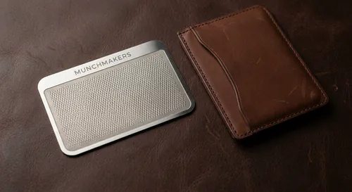
Extending brand identity to physical accessories
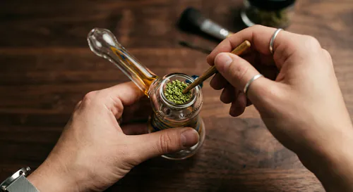
This is where cannabis brand identity has a specific opportunity that most packaged goods categories don't. A dispensary or cannabis brand can put its visual identity on physical accessories that customers use daily, which extends brand presence into daily life in a way that packaging (mostly discarded) and digital touchpoints (competed for by every other brand on a phone) simply can't match.
When your brand is on a grinder someone uses every morning, your visual identity is present at a moment of undivided attention, multiple times a week, for potentially years. A lighter sitting on a kitchen counter is a constant brand impression that cost you $3 at production. A rolling tray on a coffee table is visible to every visitor to that home.
This only works if the accessories are well-made and the branding is applied with the same care as everything else in your visual system. A logo applied crooked, or in a color that's slightly off from your brand standard, or on a grinder that feels cheap, tells customers something about how seriously you take your brand. The standard for branded accessories should be the same as the standard for your primary packaging.
The touchpoint audit is useful here: list every physical and digital surface where your brand appears, and evaluate whether each one looks like it came from the same place. The brand that has a beautifully designed website but crappy business cards and an off-color logo on their branded packaging is not presenting a coherent identity, regardless of how good any individual element is. The audit reveals the weak points and gives you a priority order for where to focus design investment.
Maintaining consistency across digital and physical
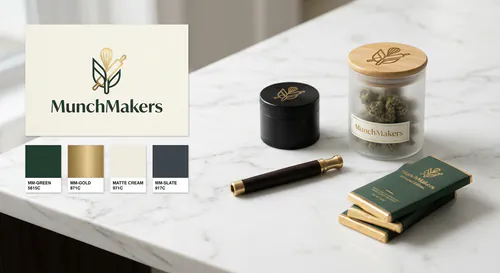
Brand guidelines are the most boring deliverable in a branding project and the most important one for everything that follows. A brand guidelines document specifies how your visual identity works in practice: exact color values (Pantone for print, hex and RGB for digital), minimum logo sizes, clear space requirements, approved and prohibited color combinations, approved typefaces and when to use each weight, and examples of correct and incorrect application.
Without a guidelines document, your brand drifts. A designer working on a new piece of collateral without clear guidance approximates what they think the brand looks like. A vendor producing merchandise without exact color values uses "close enough." A social media manager uses a slightly different shade of green because they don't have the hex code. Each of these is a small deviation, but they accumulate into visual inconsistency that customers register as a vague sense that the brand isn't quite professional, even if they can't say exactly why.
For physical applications specifically, include print specifications in your guidelines: the Pantone color codes for offset printing, the RGB values for screen-printed merchandise, and notes on how the logo should be handled for single-color applications (common for engraving on accessories or single-color print on lighters). A supplier producing your branded promotional products who has your exact specifications in hand will produce something that matches your brand. One who's working from a screenshot they grabbed from your website will not.
The guide on cannabis trade show prep covers how branded accessories are used in event contexts, which is one of the highest-stakes moments for brand consistency. If your booth materials and your branded giveaways look like they came from the same brand, the impression is professional. If they look like they were assembled from three different vendors with no shared design direction, the impression is something else.
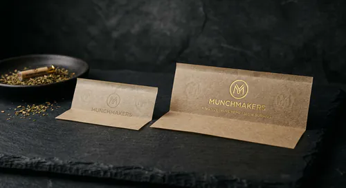
MunchMakers custom cannabis branding works with dispensaries and cannabis brands on the physical accessories side of brand identity. The work of building a coherent brand across digital, packaging, and physical products is sequential: get the strategy and visual identity right first, then extend it intentionally to each touchpoint. Trying to do it all at once is how brands end up with inconsistent results despite significant investment.